What Tech Startups Can Learn From a Strawberry Farm

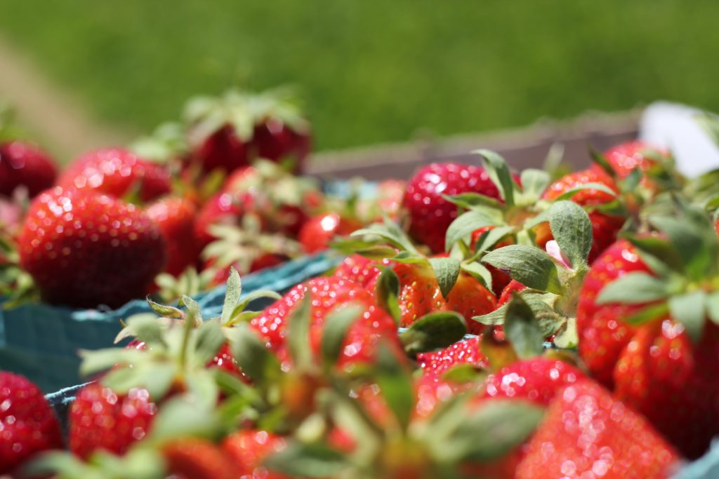
It’s coming into summer here in New Zealand. Around this time every year, the strawberry farm near our house opens for the season, selling trays of fresh strawberries and real fruit ice cream.

On a hot Sunday afternoon a few weekends ago, my partner and I were driving home from some errands. Her brother had told us that the farm was open for the season and we thought we’d stop by for ice cream.

Cars lined the streets as we approached the carpark entrance. Not a good sign. I decided to try our luck anyway, which was a mistake. We were soon stuck behind a minivan in a traffic queue with no signs of moving. We decide that my partner should jump out and queue up for ice cream; there’s no reason both of us should be stuck in the car.

After a close call with the gentleman in the minivan attempting to back his way out of the queue, I eventually escaped the chaos of the carpark and found a park on the roadside some distance away.

The queues inside for ice cream weren’t any better than the queues outside. A sea of people spilled out of the corrugated iron farm shed that served as the shop.

Imagine this with more people.

The system in the farm shed is as follows: first you queue up for the cashier on the left hand side of the shed. Here you can buy trays of strawberries and tickets for ice cream. They only accept cash (this is unheard of in NZ; even food trucks carry eftpos terminals). To actually get your ice cream/s, you then need to join one of five other queues to redeem to your ticket.

That’s the theory anyway. In practise, the sheer number of people and lack of any barriers made it hard to tell where one queue started and another ended. The five ice cream queues were longer than the cashier queue and effectively cut it off, requiring people to push through the ice cream queues to reach it.

The ticket system was confusing. One family in front of me had been waiting in the ice cream queue for some time before realising they first needed to get a ticket from the other queue.

The air inside was tense; a feeling of desperation to get one’s ice cream and get out was palpable. The self-satisfied expressions of people carrying stacked trays of fresh strawberries or ice creams back from the front didn’t help matters (okay, I might be projecting a bit here).

Matters definitely weren’t helped by the slow queues. The one we were standing in hadn’t moved perceptibly in fifteen minutes. The ones next to us were inching forward slowly at least. This discrepancy was caused by each queue being served by a different, dedicated ice cream machine operator, and there was clearly some diversity in operator experience.

On top of this, the spectre of COVID-19 is still lingering, New Zealand just having been through our second wave of cases. I know this because people behind us joked about it being a “covid queue” more than once, before giving up and leaving. Social distancing wasn’t possible in this unruly mass of people.

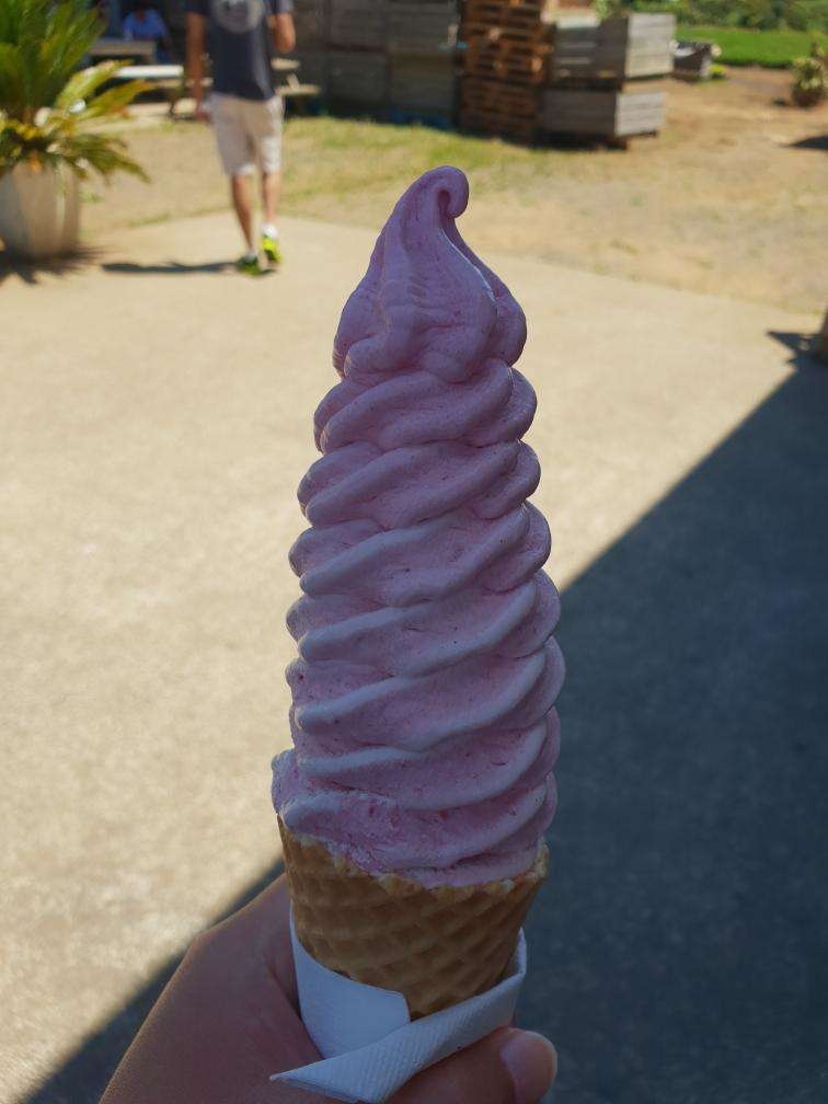
We finally got our ice creams after half an hour of waiting. There were picnic tables outside to sit at, however there was no shade to speak of. Thankfully, the late-afternoon, early-summer sun wasn’t too bad.

Once we were seated… it all made sense. You just can’t get ice cream like this anywhere else; the strawberries were so fresh. The portion size was generous to say the least. Despite everything, it was worth the wait.

Oh yes.

As I was enjoying my ice cream, I spotted a single, overflowing rubbish bin across the courtyard. There was no bathroom or anywhere to wash your hands in sight. Clearly, there was a lot the owners could do to improve things here. My partner pointed out that a single queue shared across the five ice cream machine operators, like airport luggage check-ins, would be both faster and fairer.

And yet, none of these problems – the lack of carparks, facilities, eftpos and a sane queuing system – seemed to matter one bit. They could barely keep up with the demand. It was the same last year, and I suspect every other year. I doubt they do any marketing other than word-of-mouth. Locals see that they’re open and tell their friends and family, the same way we found out. They have a product you just can’t get anywhere else, not without a long drive at least, and certainly not from any supermarket.

More than that, I suspect their no-frills approach actually works in their favour. And by this I don’t just mean that they get to avoid bank fees by only accepting cash, although that too. Their obvious popularity despite their obvious flaws is informative. The only logical explanation is that what they offer is more than good enough to compensate.

Nassim Taleb makes the same point in his book Skin in the Game in the chapter titled “Surgeons should not look like Surgeons” (emphasis mine):

Say you had the choice between two surgeons of similar rank in the same department in some hospital. The first is highly refined in appearance; he wears silver-rimmed glasses, has a thin build, delicate hands, a measured speech, and elegant gestures. His hair is silver and well combed. He is the person you would put in a movie if you needed to impersonate a surgeon. His office prominently boasts an Ivy League diploma, both for his undergraduate and medical schools.

The second one looks like a butcher; he is overweight, with large hands, uncouth speech and an unkempt appearance. His shirt is dangling from the back. No known tailor in the East Coast of the U.S. is capable of making his shirt button at the neck. He speaks unapologetically with a strong New Yawk accent, as if he wasn’t aware of it. He even has a gold tooth showing when he opens his mouth. The absence of diploma on the wall hints at the lack of pride in his education: he perhaps went to some local college. In a movie, you would expect him to impersonate a retired bodyguard for a junior congressman, or a third-generation cook in a New Jersey cafeteria.

Now if I had to pick, I would overcome my suckerproneness and take the butcher any minute. Even more: I would seek the butcher as a third option if my choice was between two doctors who looked like doctors. Why? Simply the one who doesn’t look the part, conditional of having made a (sort of) successful career in his profession, had to have much to overcome in terms of perception.

How does any of this apply to building a startup? I think this is best summarised in an essay by Paul Graham, founder of Y Combinator. He points out that a classic mistake made by new founders is “playing house”. That is, investing too much on window dressings like a flashy website, high-production-value videos, attending conferences and trade shows, getting mugs and pens with your company logo printed on them, that kind of thing, at the expense of actually building something that people love.

I know I’ve repeatedly fallen prey to this. As a founder you feel you need at least some of this surface stuff to be taken seriously. If not by investors then at least by friends and family. But as PG points out, the best way to convince investors (the non-gullible ones at least) is to build something people want. Evidence of high user engagement or growth is very convincing.

What if you’re wanting to grow your startup organically instead? You might be able to convince users to give your product a try with a slick website and marketing materials. However, if the product is underwhelming they’re not going to stick around long or say anything good to their friends. It’s not a sustainable long-term strategy.

The strawberry farm is living proof that you can build a successful business on a great product and very little else.

If you found this article useful or interesting, drop me a comment or consider sharing it with people you know using the buttons below – Matt (@kiwiandroiddev)


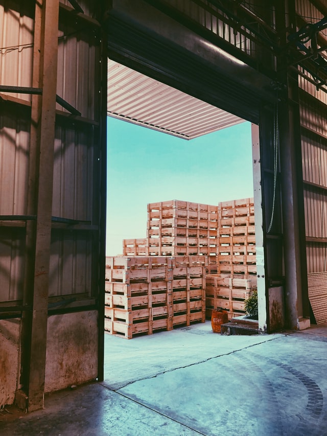
Title photo by Ana Essentiels, warehouse photo by Rushabh Nishar on Unsplash

Forcing Functions in Software Development

Here’s an unavoidable fact: the software project you’re working on has some flaws that no one knows about. Not you, your users, nor anyone in your team. These could be anything from faulty assumptions in the UI to leaky abstractions in the architecture or an error-prone release process.

Given enough time, these flaws will be discovered. But time is money. The sooner you discover them, the cheaper they are to fix. So how do you find out about them sooner?

The good news is that there are some things you can do to force issues up to the surface. You might already be doing some of them.

Here are some examples:

  • Dig out an old or cheap phone and try to run your app on it. Any major performance bottlenecks will suddenly become obvious
  • Pretend you’re a new developer in the team1. Delete the project from your development machine, clone the source code and set it up from scratch. Gaps in the Readme file and outdated setup scripts will soon become obvious
  • Try to add support for a completely different database. Details of your current database that have leaked into your data layer abstractions will soon become obvious
  • Port a few screens from your front-end app to a different platform. For example, write a command-line interface that reuses the business and data layers untouched. “Platform-agnostic” parts of the architecture might soon be shown up as anything-but
  • Start releasing beta versions of your mobile app every week. The painful parts of your monthly release process will start to become less painful
  • Put your software into the hands of a real user without telling them how to use it. Then carefully watch how they actually use it

To borrow a term from interaction design, these are all examples of Forcing Functions. They raise hidden problems up to consciousness in such a way that they are difficult to ignore and therefore likely to be fixed.

Of course, the same is true of having an issue show up in production or during a live demo. The difference is that Forcing Functions are applied voluntarily. It’s less stressful, not to mention cheaper, to find out about problems on your own terms.

If your Android app runs smoothly on this, it’ll run smoothly on anything.

If you imagine your software as something evolving over time, strategically applying forcing functions is a way of accelerating this evolutionary process.

Are there any risks in doing this? A forcing function is like an intensive training environment. And while training is important, it’s not quite the real world (“The Map Is Not the Territory“). Forcing functions typically take one criteria for success and intensify it in order to force an adaptation. Since they focus on one criteria and ignore everything else, there’s a risk of investing too much on optimizing for that one thing at the expense of the bigger picture.

In other words, you don’t want to spend months getting your mobile game to run buttery-smooth on a 7 year old phone only to find out that no one finds the game fun and you’ve run out of money.

Forcing functions are a tool; knowing which of them to apply in your team and how often to apply them is a topic for another time.

However, to give a partial answer: I have a feeling that regular in-person tests with potential customers might be the ultimate forcing function. Why? Not only do they unearth a wealth of unexpected issues like nothing else, they also give you an idea of which other forcing functions you might want to apply. They’re like a “forcing function for forcing functions”.

Or to quote Paul Graham:

The only way to make something customers want is to get a prototype in front of them and refine it based on their reactions.

Paul Graham – How to Start a Startup

If you found this article useful, please drop me a comment or consider sharing it with your friends and colleagues using one of the buttons below – Matt (@kiwiandroiddev)


1 Thanks to Alix for this example. New starters have a way of unearthing problems not only in project setup, but in the architecture, product design and onboarding process at your company, to give a few examples.

Cover Photo by Victor Freitas on Unsplash

What percentage of your users use your app daily?

Both the Developer Console and Google Analytics can display your app’s active users the number of users that opened your app at least once on each day. Knowing the number of active users is a good start to getting an idea of user engagement, but the problem with looking at it in isolation is that it doesn’t give you any idea of how many of your users have your app installed and don’t open it at all each day.

What’s needed is a new metric with more context – the number of active daily users as a percentage of total users. This is a more accurate indicator of the actual value your app is offering your users, and can be used to validate that specific changes to your app are actually making it more useful or enjoyable (in Lean Startup terms, it is more a core metric and less of a vanity metric).

How to measure daily active users as a percentage for your Android app

You will need:

  • an Android app with Google Analytics and a reasonable amount of analytics data
  • Excel, LibreOffice Calc or an equivalent spreadsheet program for plotting graphs

Note: the sample screenshots I’ve included here use data from my recently released RadioDrive app.

  1. Go to Google Play Developer Console, select your app, go to Statistics.
  2. Select Current Installs by User (this accounts for users that have your app installed on more than one of their devices, unlike Current Installs by Device).
  3. Select 1 year for the time range so you get everything.
  4. Click Export to CSV. In the dialog make sure only the Users -> Current checkbox is selected.

Now we want to get hold of data for the number of active users. The Play Developer Console does have this statistic, but unfortunately you can’t currently export the data. Onward to Google Analytics…

  1. Login to Google Analytics, select “All Mobile App Data” for your app.
  2. Click Active Users from your App Overview page.

  1. Adjust the date range (drop-down box in the top-right corner) if necessary, then click Export > CSV

  1. The next step is to import and combine both datasets in Excel. Once you have copied both sets of data into the same spreadsheet, you’ll want to sort the Developer Console data by increasing date so it matches the Analytics data. To do this in Calc, box-select all rows for the date and current_user_install columns, then select Data -> Sort -> Sort by ascending date.

  1. Move active user data so the dates correspond, if necessary…

  1. Make a new column for percentage (Formula: =(C6/B6)*100). You can delete the Day Index column now as it’s redundant.

  1. Plot a line graph (date on X axis, percent on Y axis)

So far so good, we have a graph showing the percentage of active users each day.

But there’s a problem. Say you release an update for your app that is a total flop. Users start to uninstall your app in droves, except for a small segment of your dedicated fans. In this case, the percentage of active users may actually go up, as your botched update eliminates all but your most loyal users.

If you keep an eye on your other statistics such as daily uninstalls and number of active users (as well as monitoring actual user feedback), you would (hopefully) pick up this kind of scenario. However it’d be nice to be able to see this situation occurring in the same graph.

To do this, you can simply plot current user installs or number of active users on the same axes. That way, you’ll know something is up if either of them start trending downward.

Here I’ve plotted current user installs on a secondary Y axis:

The final graph (after adjusting the percentage scale to prevent overlap):

(In case you’re wondering, the lack of active user data until the 8th Dec is due to Google Analytics not being in the app until then!)

Extra credit: add a 3 or 5 day moving average trend line to % Active Users to smooth out fluctuations (having a larger sample size helps with this also).

What core metrics do you measure for your app and what tools do you use to measure them?