

It’s interesting how learning is sometimes like travel. At the end of the journey, you end up back where you started, only with a broadened perspective.
Trivial example: code comments. As a new programmer, I commented my code extensively. This was probably to compensate for my difficulties in reading code. It also allowed me to be lazy in the code I wrote. There isn’t as much of a need for clear and readable code when there are always plain English comments to fall back on.
Then I joined a team that was militantly against comments. Every comment was an admission of a failure to write readable code. I took this on-board and disciplined myself not to rely on comments. This forced me to spend more time on refactoring my code to make it as readable and “self-documenting” as possible. I still wouldn’t say I’m there yet, but I’m confident that my code is much more readable now than it was then.
However, in the last year or so, I’ve started adding comments again. Not too many, but here and there to add more context. It felt like blasphemy at first. Some of my comments are even somewhat redundant, but I’ve since learned that encoding the same information in redundant ways aids comprehension. For example, traffic lights use both colour and position to encode the same information.
Superficially it seems as though I’ve returned to where I started: I’m commenting code again. However, if I hadn’t disciplined myself to do without comments for a while, I wouldn’t have been forced to learn how to write more readable code. Abstaining from code comments is a forcing function for more readable code. At some point, you can re-integrate commenting as a useful tool rather than a crutch.
Interestingly, I’m confident that if I could travel back in time and tell past-me or any of my old teammates that, actually, comments can be a valuable tool to aid comprehension, I’m positive I would encounter strong resistance. This is just as it should be; I don’t think it can be any different. When you’re learning a new skill, it’s necessary to become somewhat closed off and follow a direction single-mindedly for a while. It’s part of the learning process. If you were too suggestible and deviated too easily, you would go around in small circles and never get anywhere.
You see the same pattern across the development community when a new technology or framework is introduced (I won’t name names. I’m sure you can think of some examples). In the early days, there is hype and zealotry. Then over time as more developers adopt the tech into production and real issues with it emerge, there is disillusionment and abandonment. Finally a more realistic, calibrated picture of the trade-offs of the technology emerge.

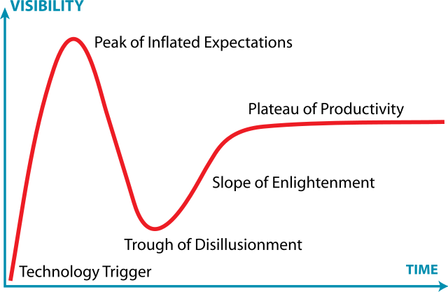
Hype Cycle graph by Jeremykemp at English Wikipedia, CC BY-SA 3.0, https://commons.wikimedia.org/w/index.php?curid=10547051, Middle Earth photo by Henry Xu on Unsplash
